Image source: Freepik
Introduction
The Pantone color of the year 2026 arrives during a period when many people are reassessing how their homes function in daily life. In a noisy world shaped by constant updates, endless search, and a steady stream of images, the home has become more than a place to rest. It has become a filter against a frenetic society. The color of the year, selected by the Pantone Color Institute, reflects this shift. Cloud Dancer is a restrained shade rooted in quiet reflection, offering a response to overstimulation rather than a reaction to trends. For Filipino households navigating the year 2026, this Pantone color aligns with the joy out of achieving the desire for peace, clarity, and spaces that support how people actually live, work, and rest.
Design Tip #1: Use the Pantone Color of the Year 2026 as Your Base Neutral, Not an Accent
Treating Cloud Dancer as an accent limits its potential. Instead, use it as the foundation of your color palette. In practical interior design, base neutrals shape how every other element is perceived. Applying Pantone Color 11-4201 (Cloud Dancer) on the primary living room walls allows the space to settle visually. Unlike stark white, the tone introduces softness without dimming the room. This approach reflects how the Cloud Dancer represents restraint and emotional balance, helping the room feel grounded even as furniture, decor, and daily things change over time.
Using the color this way creates immediate clarity. It allows the home to support focus during the day and rest in the evening. For households spending long hours indoors, the calming influence becomes noticeable not as a dramatic shift, but as a steady improvement in how the space feels to inhabit.
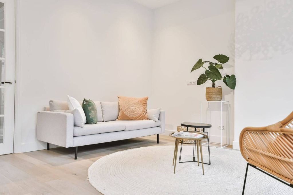
Image source: https://www.freepik.com/premium-photo/modern-furniture-bright-living-room_16283081.htm#from_element=cross_selling__photo
Design Tip #2: Replace Stark White Finishes with Cloud Dancer for a Softer Interior Design Palette
Many homes rely heavily on bright white finishes because they feel safe and familiar. Over time, though, these surfaces can feel harsh, especially under artificial light. Replacing select white finishes with Pantone 11-4201 (Cloud Dancer) introduces warmth while keeping the overall look clean.
Doors, ceiling planes, and built-in cabinets are ideal candidates. This change requires no structural work and minimal services, yet it shifts the emotional tone of the space. The result is a palette that supports living rather than display. The color absorbs light gently, reducing glare and helping the space feel calmer during a busy day. In a world that rarely slows down, these small adjustments carry real value.
Design Tip #3: Choose Cloud Dancer for Bedrooms to Reduce Visual Noise
Bedrooms should offer a clear break from the demands of the day. Applying Cloud Dancer to surfaces most visible from the bed, such as headboard walls or large closets, helps quiet the visual field. The color does not compete for attention, allowing the mind to rest.
This aligns with insights shared by Laurie Pressman, the executive director of Pantone, who has spoken about society rediscovering calm as a necessity rather than a luxury. In practice, this means bedrooms that promote serenity and a soothing atmosphere at the end of the day. Over time, the effect supports better routines and a deeper sense of peace, even in compact spaces.
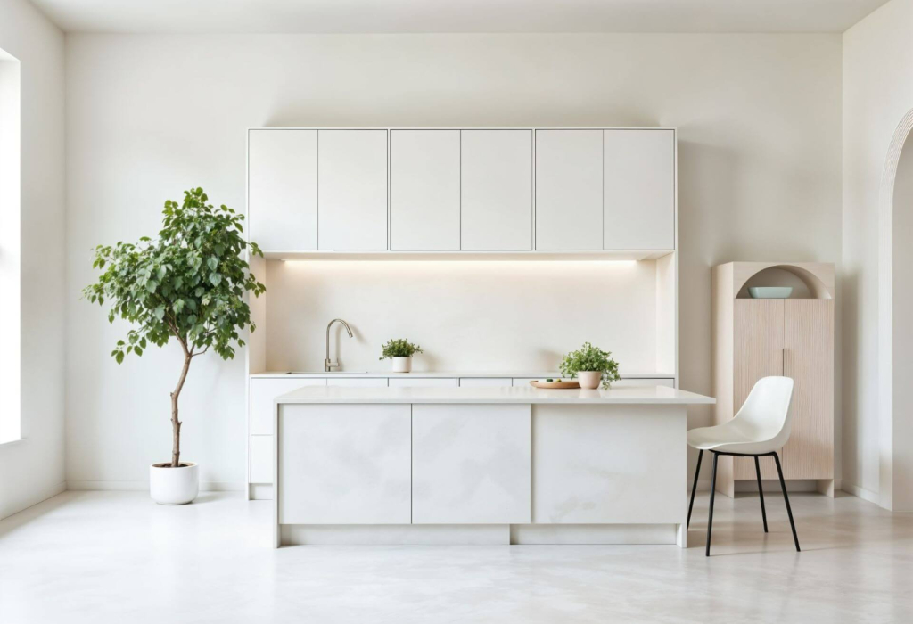
Image source: https://www.freepik.com/free-ai-image/elegant-minimal-interior-design_408477686.htm
Design Tip #4: Use the Pantone Color Strategically in the Kitchen to Emphasize Cleanliness Without Coldness
The kitchen is one of the most active spaces in the home, which makes color choices here especially important. Using Cloud Dancer on upper cabinets or backsplash zones reinforces a sense of order and clean design without making the space feel clinical.
This application supports the idea of a fresh start each morning. The color pairs well with natural materials and holds up visually under frequent use. It feels intentional rather than trendy, a decision based on function as much as appearance. For families who gather in the kitchen throughout the day, this balance helps the space remain welcoming and easy to maintain.
Design Tip #5: Pair Cloud Dancer with Natural Materials to Avoid a Flat Look
A restrained color needs texture to stay engaging. Pairing cloud dancer with wood, woven fibers, or matte stone prevents the interior from feeling flat. These combinations reflect measured consideration, ensuring the color remains interesting without overwhelming the senses.
This approach allows flexibility. A new chair, a different fabric, or even a well-placed book can refresh the space without repainting. Over years of use, the color continues to feel relevant, adapting to changing tastes and needs. This is where the design proves its considered nature, supporting longevity rather than constant change.
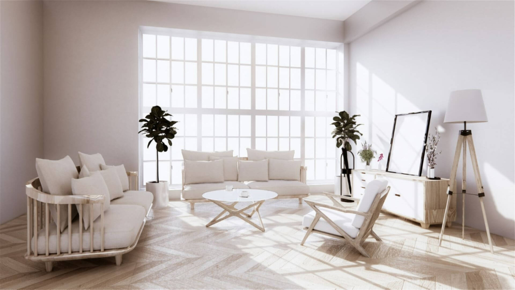
Image source: https://www.freepik.com/premium-photo/vintage-sofa-armchair-living-room_10437280.htm#from_element=cross_selling__photo
Design Tip #6: Use 2026 Pantone 11 4201 to Create Visual Continuity Across Connected Rooms
Homes with open or semi-open layouts benefit from color continuity. Repeating 2026 Pantone 11-4201 across hallways, stair landings, and shared sightlines helps spaces connect naturally. Instead of abrupt transitions, the home reads as a single, coherent environment.
This strategy works particularly well in newer residential settings such as Camella Monticello, where connected spaces are common. A unifying color supports daily movement through the place, reinforcing calm within growing communities. It also reflects how society rediscovering the value of thoughtful planning extends beyond individual rooms to the entire home experience.
Design Tip #7: Extend Cloud Dancer Beyond Walls Through Furniture and Everyday Details
Paint is only one way to introduce the color. Upholstery, curtains, cushions, and even small decor items allow the Cloud Dancer to appear repeatedly without dominating the space. These additions can be made gradually, added over time as needs and preferences evolve. The color begins to whisper rather than announce itself, shaping the atmosphere subtly. When done well, the repetition supports emotional consistency, helping people hear themselves think amid daily demands.
Image source: https://www.freepik.com/premium-photo/empty-white-sofa-decoration-living-room_7630626.htm#from_element=cross_selling__photo
Key Takeaways
The Pantone color of the year 2026 is not just a major consideration in fashion these days, but reflects a broader shift in how homes respond to modern life. Cloud Dancer offers a practical answer to overstimulation, supporting spaces built around clarity, focus, and emotional ease. In the year 2026, Pantone 11 4201 is positioned as more than a passing trend, moving beyond a single post in a design newsletter and into everyday living.
In a landscape crowded with competing brands and constant updates, the Pantone color for 2026, Pantone 11-4201, stands out by stepping back. It allows the home to become a steady presence in an unpredictable world, offering balance, calm, and a renewed understanding of what truly matters.