Image source: Freepik
Introduction
Color has always played a quiet but powerful role in Filipino homes. Long before trends moved through Instagram or Facebook, families already understood how light, shade, and tone could shape mood, routine, and relationships. Today, more homeowners are paying closer attention to how color choices influence not only aesthetics but also focus, confidence, and emotional balance throughout the year ahead.
This interest aligns closely with conversations around the Chinese zodiac sign tied to 2026, particularly the energy associated with the fire horse. The lucky colors for year of the fire horse 2026 are often discussed in terms of symbolism, yet they also carry practical design value. This article explores how Emerald and Gold can be applied with intention, turning symbolism into livable design choices that support optimism, growth, and a grounded beginning for the year of the fire.
Use Daylight to Test Emerald Shades Before Final Application
Every good color decision begins with light. In the Philippines, daylight shifts dramatically throughout the day, especially in homes that face the east. Morning light tends to be soft and cool, while midday sun is hot and intense, often amplifying saturation in ways that surprise homeowners after paint has dried. Before committing to emerald green, it is essential to test samples at different times of day.
Apply small patches of green on the wall and observe how the color behaves from early morning to late afternoon. This process helps avoid shades that appear dull in the morning or overly sharp at noon. Emerald that feels calm under cloud cover but harsh under full sun can disrupt the flow of energy in the home. Testing allows you to choose a tone that enhances positive energy without overwhelming the space. This careful observation sets a strong foundation for success, especially in a year associated with movement and change.
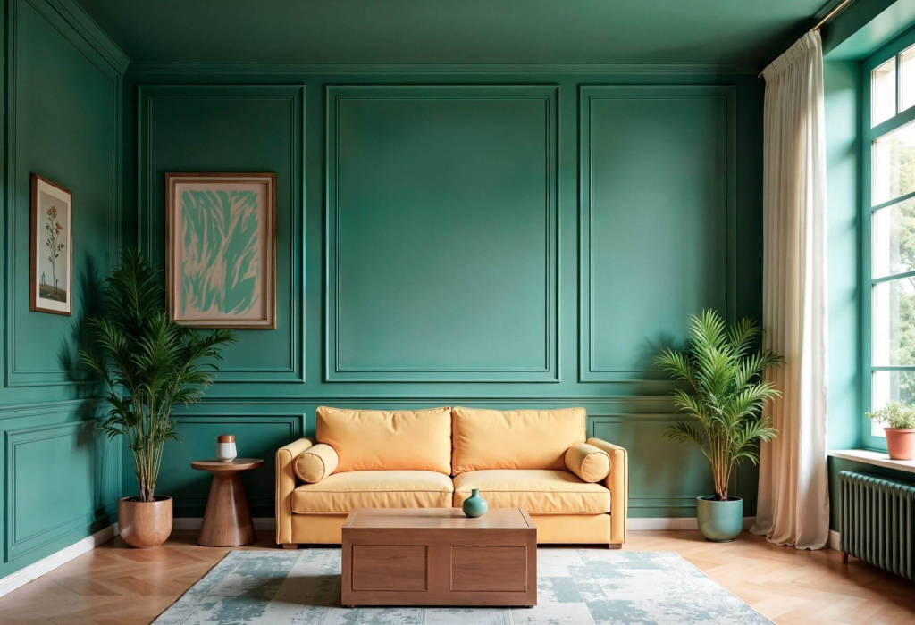
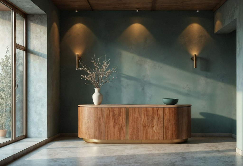
Paint One Emerald Anchor Wall for Balance in the Year of the Fire Horse
Once the right shade is chosen, restraint becomes the key. Instead of painting an entire room green, focus on a single anchor wall in a space that naturally draws attention. Living rooms and dining areas are ideal because they are places where relationships, conversation, and daily rituals unfold.
An emerald anchor wall provides visual stability during the year of the fire horse, which is often linked to movement, passion, and momentum. The color grounds the space, creating a sense of clarity that supports decision-making and focus. Matte or eggshell finishes work best, as they absorb light gently rather than reflecting it aggressively. This approach respects the fire element while preventing visual overload, allowing the home to feel balanced rather than restless.
Pair Emerald With Natural Wood or Stone to Ground Fire Energy
Color never exists in isolation. Emerald green works best when it is visually connected to natural materials that carry earth energy. Wood furniture, stone surfaces, woven textures, and clay décor help temper the intensity and bring a sense of stability into the room.
When an emerald wall shares the same sightline as a wooden table or stone accent, the space feels anchored. This pairing reflects the balance between elements, where earth supports growth and prevents excess heat from dominating the environment. In practical terms, it also makes the color feel more livable and less decorative. The room becomes a place where people can settle, think clearly, and continue daily routines with ease.
Apply Lucky Colors Where Movement and Connection Happen During the Year of the Horse
The year of the horse is often associated with activity, interaction, and forward momentum. For this reason, emerald and gold should appear first in areas where people naturally gather and move. Living rooms, dining spaces, and open-plan areas benefit most from these lucky colors because they shape shared experiences over time.
Emerald tones inspired movement through light. It can soften shared spaces, reminding residents that balance often means allowing rooms to change gradually. When there is plenty of movement and activity, it helps to pause, read the room, and notice which things truly support comfort. With that awareness, homeowners begin to find design choices that feel personal, grounded, and sustainable.
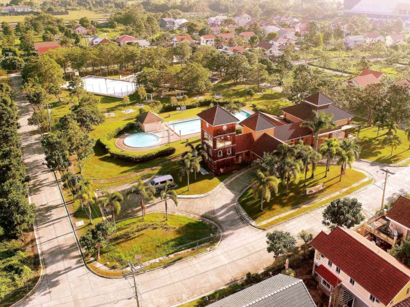
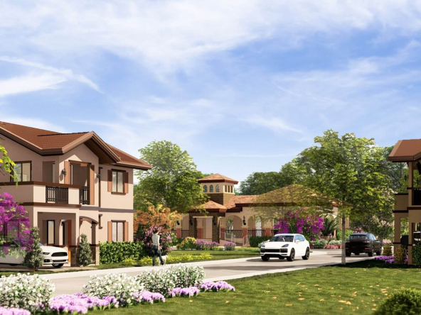
In communities such as Camella Homes’ Tudor Square in Tanza, Cavite, where layouts encourage family interaction and neighborhood connection, color choices in common areas can subtly enhance daily life. Emerald walls paired with gold accents in lighting or décor help guide movement while maintaining warmth and harmony. These spaces become settings for joy, conversation, and continuity, supporting relationships as the year unfolds.
Use Emerald Textiles Instead of Walls in Private Spaces
Bedrooms and quiet corners require a different approach. While emerald green carries growth and renewal, too much of it in private spaces can feel heavy, especially at night. Instead of paint, introduce the color through textiles such as curtains, cushions, or upholstered chairs. You can consider pairing this with a more muted wall color, like the Pantone color of the year, Cloud Dancer.
This method allows the color to protect and support rest without dominating the room. Soft green fabrics help regulate emotion and encourage health, offering a calm contrast to the heat of daily life. Because textiles are easy to change, they also give homeowners flexibility as needs evolve. This adaptability reflects the idea of a fresh start without locking the space into a single expression.
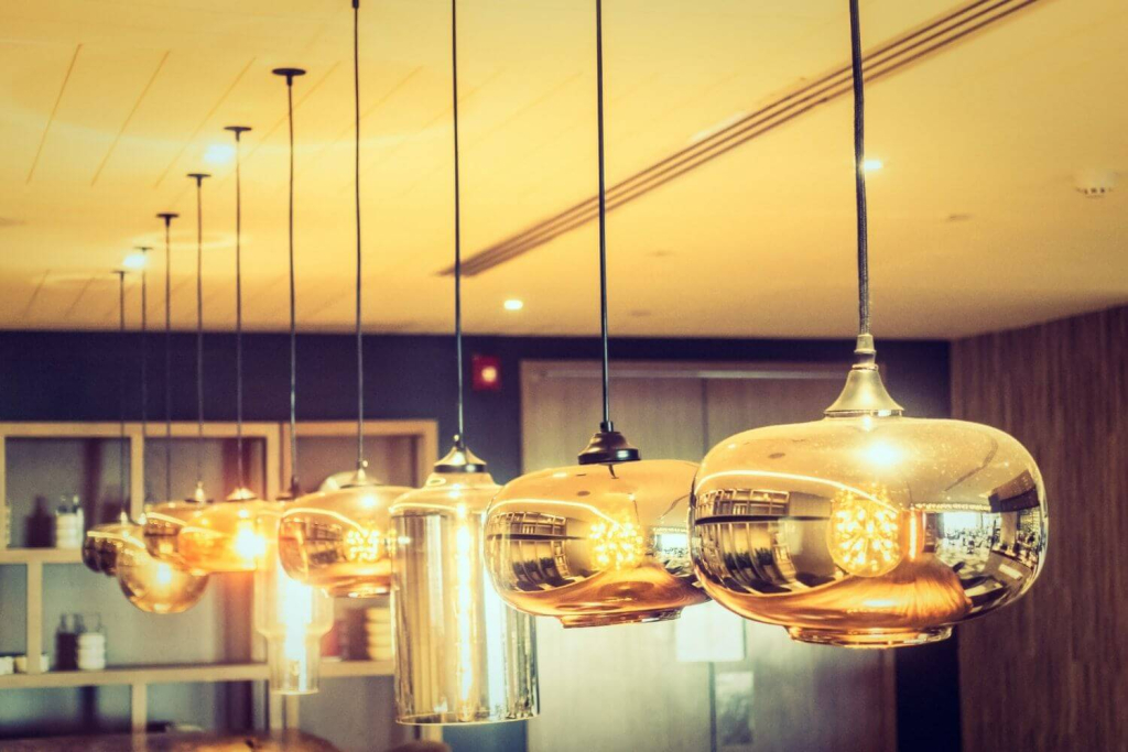
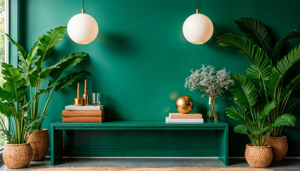
Limit Gold to Fixed Architectural Touchpoints
Gold is often associated with wealth, confidence, and prosperity, yet its impact depends heavily on placement. Rather than spreading gold across decorative items, focus on fixed architectural elements that do not shift frequently. Lighting trims, cabinet handles, door hardware, and railing details are ideal locations.
These fixed points create a sense of permanence and stability, reinforcing feelings of security and control. In the context of the fire horse, gold placed intentionally helps channel leadership and courage without tipping into excess. The color becomes a quiet sign of support rather than a loud statement, allowing it to shine without overwhelming the senses.
In homes where gold is introduced through lighting, the warmth often leans toward yellow, which subtly reinforces optimism without overpowering the space. This tone works well in areas used early in the day, when natural light is softer and routines are just beginning. By letting yellow-tinted light interact with emerald surfaces, the home maintains visual warmth while preserving clarity and balance.
Keep Gold Accents at Eye Level or Above
Vertical placement matters more than many people realize. Gold accents work best when positioned at eye level or higher. Mirrors with gold frames, wall-mounted lighting, and upper shelving details draw the gaze upward, creating a sense of openness and confidence.
Avoid placing gold near the floor, where it can feel heavy and disrupt visual flow. Elevated placement enhances clarity and focus while allowing the color to reflect light effectively. This approach also aligns with practical considerations in Filipino homes, where lower surfaces are more exposed to dust and wear. By keeping gold above, the space feels lighter and more intentional.
Cap Emerald and Gold Usage at Two Spaces Per Floor
Even lucky colors require limits. A clear rule helps maintain harmony throughout the home. Restrict strong emerald and gold elements to no more than two spaces per floor. This cap prevents visual conflict and ensures that each application feels deliberate.
When every room competes for attention, the home loses clarity. By setting boundaries, homeowners allow each space to breathe and serve its purpose. This discipline supports long-term comfort and makes it easier to adapt as changes arise. Balance, after all, is not about abundance alone but about knowing when to stop.
For some homeowners, color choices also connect to personal beliefs and timing. Pay closer attention to how spaces develop over time rather than how they look all at once. In many Filipino households, design decisions quietly acknowledge God, routine, and intention, treating the home as an account of daily habits rather than a static display.
Conclusion
Emerald and gold are tools that shape how a home feels over time, influencing confidence, stability, and the ability to navigate opportunity and change. In a year marked by movement, passion, and growth, thoughtful design choices help transform abstract ideas of good fortune into lived experience. By observing light, setting limits, and pairing color with natural materials, Filipino homeowners can create spaces that support clarity, joy, and steady progress. When color is chosen with awareness, the home becomes a quiet ally, offering balance as life continues to unfold.